设计中的独特风格(设计有范帝斯设计新作)
建筑与基地间应当有着某种经验上的联系,一种形而上的联系,一种诗意的连结!
——斯蒂文·霍尔(美国)
请旋转手机观看↓

海峡高新双创园服务中心,占地45亩,面积6.5万方。是为更好地为园区企业而设立的科技服务共享与交易平台。
The service center of the Straits hi tech innovation and entrepreneurship Park covers an area of 45 Mu and 65000 square meters. It is a science and technology service sharing and trading platform set up for enterprises in the park.

设计师在遵循旨意、融合理念,充分挖掘双创园各大功能场所的个性,让空间表达以国际化、现代化的园区为核心设计理念,同时在有限的造价中尽量达到一定的效果还要保证品牌气质,凸显设计价值和能力。
The designer follows the purpose and integrates the concept, fully excavates the personality of the major functional sites of the innovation and entrepreneurship Park, and makes the space expression take the international and modern park as the core design concept. At the same time, the designer tries to achieve a certain effect in the limited cost, but also ensures the brand temperament and highlights the design value and ability.

光与影的思绪构造与升级

双创园服务中心六号楼整体体现了极简、几何、具有清晰线条感的建筑美学,内部整个空间以点线面的构建方式将新的空间关系赋予到原始空间框架中。真正呈现艺术与空间之间的秩序及比例关系,从而创造和激发一种通过比例与和谐产生的空间美感。
Building 6 of the service center of the mass entrepreneurship and Innovation Park reflects the architectural aesthetics of minimalism, geometry and clear lines. The whole internal space gives new spatial relationships to the original spatial framework in the way of point, line and plane construction. Truly present the order and proportion relationship between art and space, so as to create and stimulate a space aesthetic feeling through proportion and harmony.


服务大厅以行云流水之势,营造出一个大气简约且明亮的空间,与公共区域元素统一,空间干净利索。形式追随功能,从实用的角度出发,重视空间感受,强调光的渗透。
The service hall creates an atmosphere, simple and bright space, which is unified with the elements of the public area, and the space is clean and tidy. Form follows function. From a practical point of view, it attaches importance to spatial feeling and emphasizes the penetration of light.


展厅借用蓝色海洋之势,打造大型船舱式沉浸体验空间:在空间布局上,设计师运用巧思,天花板的灯带犹如奔腾的海浪,柱子暗喻“中流砥柱”,多种元素集合,层层推进,将空间的情绪氛围感推向高峰。
The exhibition hall borrows the potential of the blue ocean to create a large cabin style immersive experience space: in the spatial layout, the designer uses ingenuity. The light belt on the ceiling is like a surging wave, and the column metaphors "the mainstay". A variety of elements are gathered and pushed forward layer by layer, pushing the emotional atmosphere of the space to the peak. .
旋转手机更精彩↓

展厅区充分调动色彩的互动,使用乳白撞色克莱因蓝的搭配,调和硬朗冷静的空间氛围。
In the exhibition hall, the interaction of colors is fully mobilized, and the combination of milky white and Klein Blue is used to reconcile the hard and calm space atmosphere.

路演大厅的设计,则是通过比例、线条与灯光的运用,让空间显得庄重而不压抑。
The roadshow hall is designed to make the space look solemn and not oppressive through the use of proportion, lines and lights.

整个项目的设计简约又清晰,且能快速自由调整去应对员工随时召开会议的需求。这样的规划增强了空间的灵动性,也大大提升了空间的高效利用。
The design of the whole project is simple and clear, and can be quickly and freely adjusted to meet the needs of employees to hold meetings at any time. Such planning enhances the flexibility of the space and greatly improves the efficient use of the space.


众创办公室遵循现代极简的设计原则,冷光灯带的植入,内外相连、将空间氛围延续,使得空间更加前卫与沉浸,凸显未来视野的空间感。
The maker office follows the design principle of modern minimalism, with the implantation of cold light strips, connecting the inside and outside, continuing the space atmosphere, making the space more avant-garde and immersive, highlighting the sense of space in the future vision.

空间与形式的秩序重组

前厅作为门面担当,是文化与气质的集中体现,也是实力的绝对彰显。7号楼与别处区别在于设置了星创、众创两个基地,并分别开设了入口。
星创基地的前厅,通过顶部色彩的加持,对空间秩序进行了别出心裁的重组。
As a facade, the front hall is the concentrated embodiment of culture and temperament, and also the absolute demonstration of strength. Building 7 is different from other buildings in that it has two bases, star maker and maker, with entrances respectively.
The front hall of Xingchuang base has made a unique reorganization of the spatial order through the blessing of the top color.

众创基地前厅则以一整面亮黄色背景墙打底,结合蓝白色搭配的前台,整体氛围相对和谐、流畅。在浅米色地面的搭配下,空间感更加沉稳大气。
The front hall of the maker base is bottomed with a bright yellow background wall, and combined with the blue and white front desk, the overall atmosphere is relatively harmonious and smooth. Under the collocation of light beige ground, the sense of space is more calm and atmospheric.
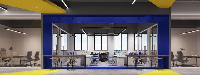
办公区域采用半透明的玻璃隔断来提供必要的私密空间。如此,在满足功用的前提下亦能创建一个没有视觉阻隔的开放式办公空间。
The office area is separated by translucent glass to provide necessary private space. In this way, an open office space without visual barrier can be created on the premise of meeting the functions.

休息区的设计创意采用幽默漫画式风格,不同规格的创意摆件,让人忍俊不禁的同时,能达到最佳的休息效果。
The design creativity of the rest area adopts the humorous cartoon style, and the creative decorations of different specifications can make people laugh and achieve the best rest effect at the same time.


优秀的设计总能以简单的手法实现空间的秩序重组。
过道的呈现,有一种独有的流线型动态感,线型灯带的延展性铺垫,让过道区域像是一场大型的穿越剧。花费不大,却让空间告别了平庸。
Excellent design can always achieve the order reorganization of space in a simple way.
The presentation of the aisle has a unique streamlined dynamic sense, and the ductility of the linear light belt paves the way, making the aisle area like a large-scale cross Yue opera. Cost little, but let the space bid farewell to mediocrity.
平面设计图


项目信息
项目名称:海峡高新双创园服务中心
项目地址:福建福州·马尾
项目面积:约1500㎡
设计单位:福州帝斯建筑设计顾问有限公司
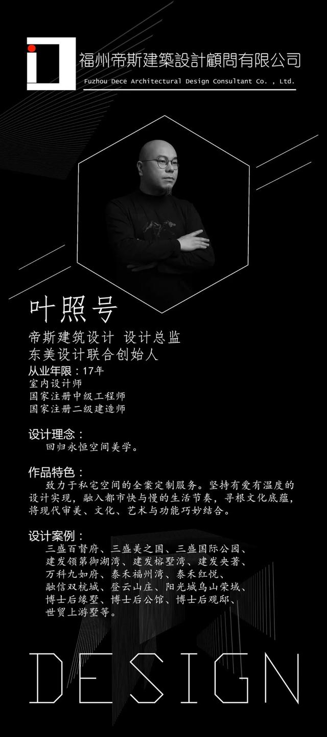
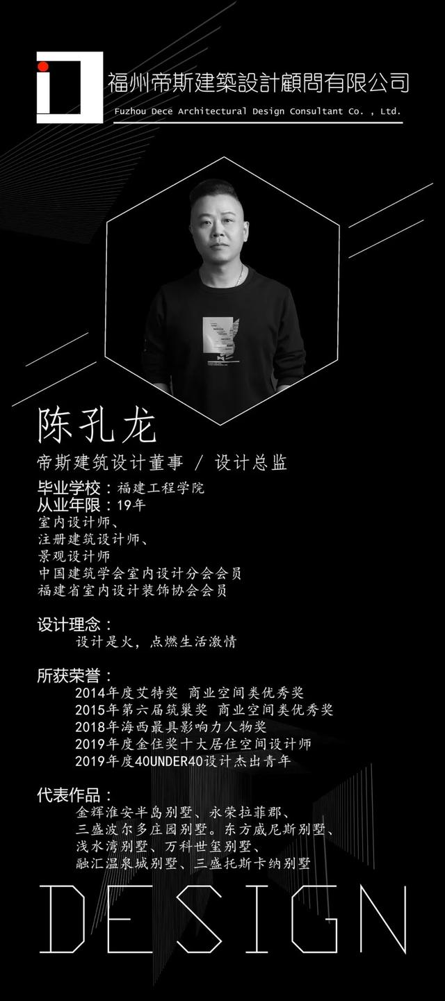
室内设计:叶照号、陈孔龙
设计师/Designer

免责声明:本文仅代表文章作者的个人观点,与本站无关。其原创性、真实性以及文中陈述文字和内容未经本站证实,对本文以及其中全部或者部分内容文字的真实性、完整性和原创性本站不作任何保证或承诺,请读者仅作参考,并自行核实相关内容。文章投诉邮箱:anhduc.ph@yahoo.com

