yes salon美发店港口店(DSSalon美发沙龙)

商业项目设计主题明确,周期短,类似在拍摄一则广告,而不是电影。室内空间的营造需要对购买行为具有吸引力,并非奇特的表现,而是构建吸引购买者的场所特征。
Commercial projects have clear design themes and short cycles, just like the shooting of an advertisement rather than a movie. The design of an indoor space needs to be attractive to purchase behaviors, which is not strange but to create features of the place that attract purchasers.

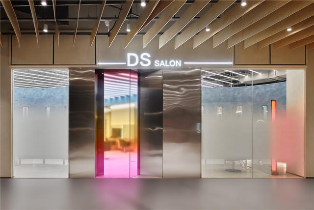
▲店铺入口,the entrance

▲入口处功能融合,integration of entrance functions

▲由入口看向包厢,viewing the room from the entrance

▲半开放包厢外部,exterior of the semi-private room

▲半开放式包厢内部,interior of the semi-private room

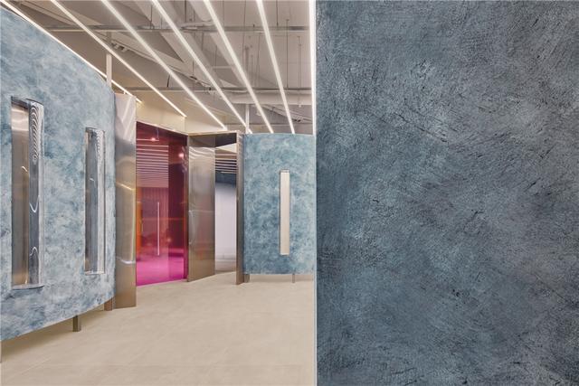
▲包厢入口的彩色玻璃,Stained glass at the entrance to the semi-private room
受业主委托对DS沙龙二店进行设计,设计之初随业主参观了一店的整体服务的操作流程,并详细记录了所需设备的尺寸,功能分区,方便之后适当规划,印象深刻的是陈列在展架上颜色丰富的染膏,直觉联想到以前的理发店门口的“三色柱”,决定把这一元素提取,选择彩色的渐变玻璃在项目的门头及室内空间进行点缀及延续。
Entrusted by the owner, I designed the second store of DS Hair Salon. At the beginning of design, I visited the first store with the owner, to learn about the overall service procedures and record dimensions of equipment required and functional zones in detail, for the convenience of appropriate planning later. What impressed me was tints in rich colors displayed on the shelf, which were intuitively associated with the “three-colored poles” at the gate of the barber’s, so I decided to extract the element and chose to decorate and extend the storefront and interior of the project with glass in color gradients.

▲建筑外观, exterior view

▲立面细部,closer view to the facade

▲储物区,the storage area

▲等候区,waiting area


▲开放式理发区,the open space
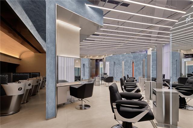
顾客由彩色的玻璃引导进入室内,由大门进入是一条长长的通道,顶面半弧形不锈钢吊顶配合灯光衬托时尚感,存衣区和前台区域相连由一扇移门隔开保证各自空间的私密性,空间中嵌入局部的卡座,方便暂时的停留等候,走道尽头内透的空间放入蓝色的色块,提供店内的拍摄的背景,店外的行人从大门看进来,视线落在打卡拍摄的顾客身上,好比是走秀台远端的模特,自然形成展示的场景,能够彼此交流。不锈钢的顶面从前厅一直延伸到室内,洗头区的两块不同颜色的弧形顶面,堆积木一样搭接在不锈钢上方,去除点光源,依靠灯带的反射提供区域的照明,给顾客温馨、放松的心里感受。理发区从地面升起两段弧形墙面,形成半私密性的包厢,弧形墙的做法是希望包厢是类似一个有颜色的“容器”而不是传统的四面隔墙的房间,并且在两段的弧形墙体中,拓展出一个个圆弧形透明腔体,人的视线穿过透明的腔体发生改变,也会形成不一样的感受。沙龙的展示功能区放在空间动线的交汇处,展柜的透明性,通透性旨在最大限度的展示商品,同时把展柜与墙面的形体脱开,产生视线。
Through the gate, customers are led by stained glass into the interior, to see a long passageway, the arched stainless steel ceiling of which matched with lighting set off a sense of fashion. The cloakroom and the front desk are connected but separated by a sliding door, to guarantee the privacy of each space. Booths are embedded into some parts of the passageway, for the convenience of staying and waiting. At the end of the passageway, blue color blocks are placed in the transparent space, to provide a background for taking pictures in the store. Outside the gate, pedestrians can see customers taking pictures in the store, who are just like models at the far end of a catwalk and naturally form a display scene, to realize communication between inside and outside. The stainless steel ceiling extends from the lobby all the way to the interior, above which two arcs of the ceiling in different colors are overlapped and connected at the hair washing zone, like toy blocks stacked up, where point sources of light are replaced with strip lights for illumination, to create a cozy and relaxing experience for customers. In the hairdressing zone, two ps of arc walls rise from the ground to form semi-private boxes. The design of arc walls is intended to make boxes like painted “containers” rather than traditional enclosed rooms. Besides, in these two arc walls, transparent circular arc cavities are expanded, through which the sight of people will change, to create a distinctive feel. The display zone of the salon is arranged at the junction of spatial circulations. Transparent showcases are aimed to display commodities to the largest extent, while breaking away from the shape of walls, to generate sight.

▲由等候区看洗头区,viewing the shampooing area from the waiting area

▲洗头区,the shampooing area

▲洗头区柜体,cabinet in shampoo area

▲细部,details

▲形体分割,产生视线,the body is divided to produce the line of sight

▲亚克力柜体,acrylic cabinet body
,免责声明:本文仅代表文章作者的个人观点,与本站无关。其原创性、真实性以及文中陈述文字和内容未经本站证实,对本文以及其中全部或者部分内容文字的真实性、完整性和原创性本站不作任何保证或承诺,请读者仅作参考,并自行核实相关内容。文章投诉邮箱:anhduc.ph@yahoo.com


